- DOWNLOAD RESUMEresume
Senior Product Designer
Highlights my hands-on design work, UX research, and product delivery
Product Design Lead
Highlights my team leadership, design strategy, and stakeholder management
- MY PRODUCTS
Travlo - World's First AI Travel Agent
Launched Now
Bloop - Let's make a blooper!
Launched Now
- PORTFOLIOwork
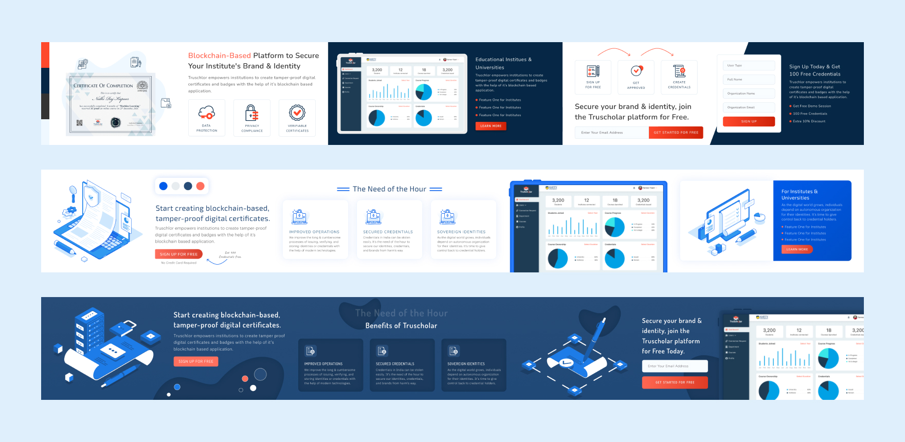
Projects
Quick view of the final delivered products
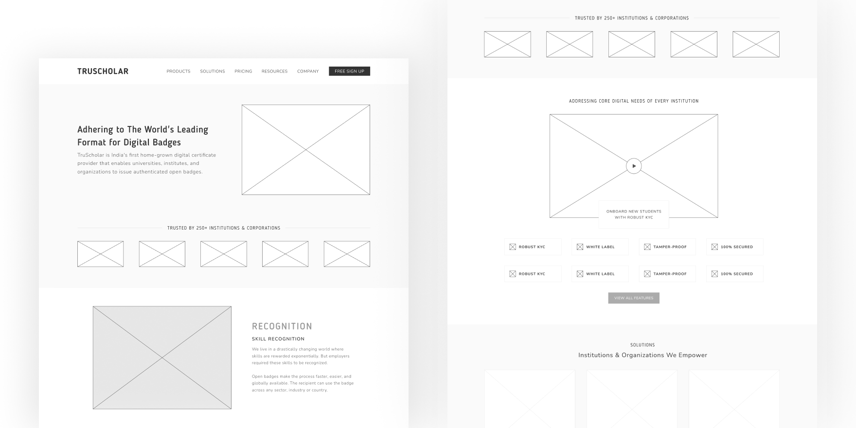
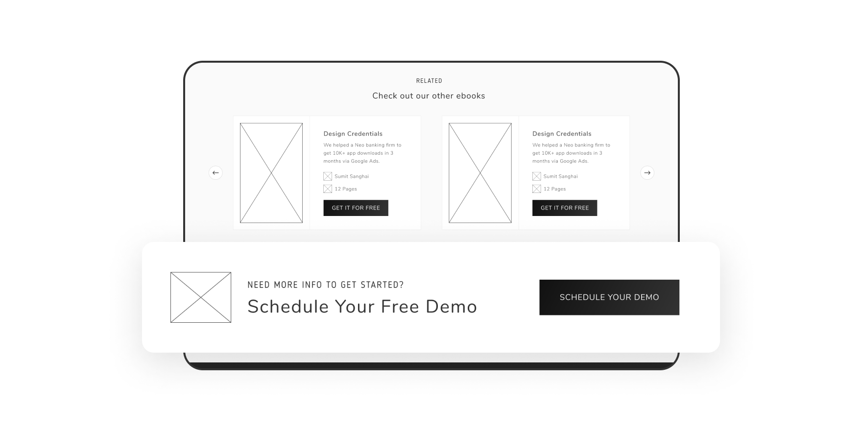
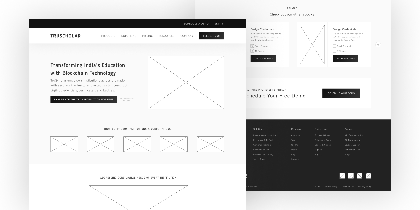
Case Studies
Projects details with process and results at each phase
- HIRE ON TOPTAL
- GET IN TOUCH